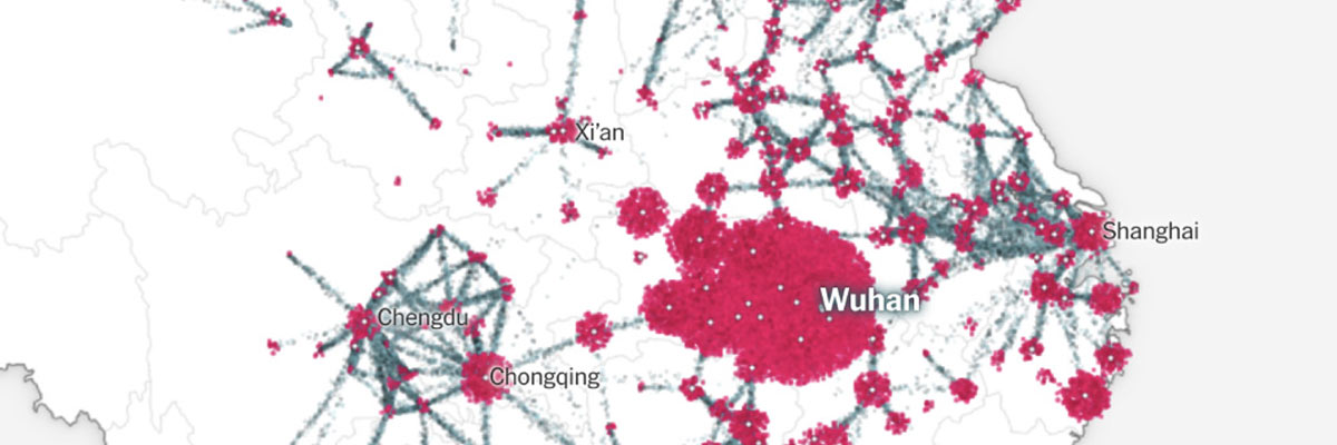
This interactive data journalism from the New York Times visualizes the spread of COVID-19:
As a complex insightful piece of data viz, this post should be in my dope category but the subject matter is far from positive.
If you're tapped out on your NY Times article limit, check the Twitter Moment and take this thing seriously.