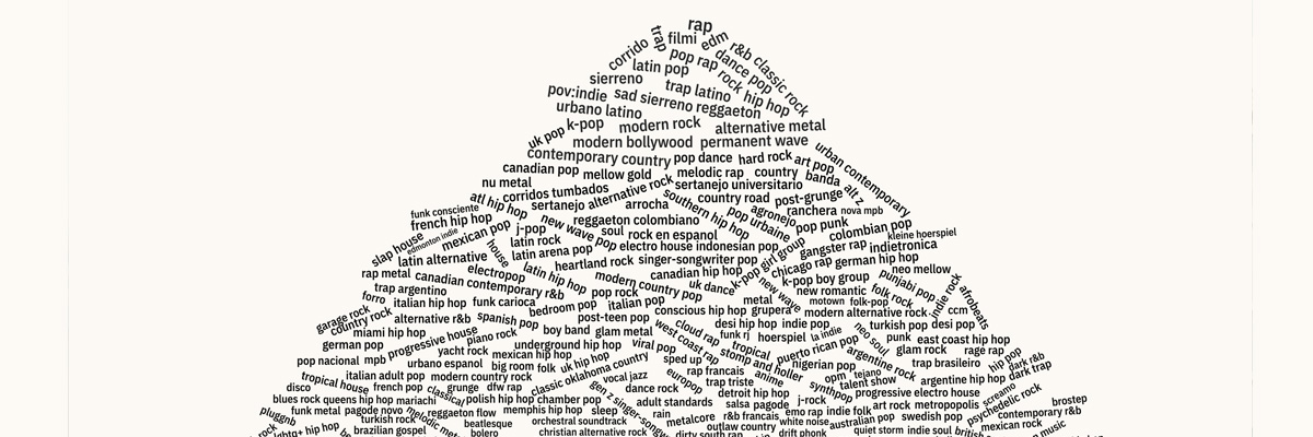
Checkout this dope site that visually analyzes how and why Spotify’s most popular genres have shifted over the past 7 years:
"You should look at this chart about music genres"

Published by Matthew Daniels’ The Pudding, it follows the “Instagram stories” UI pattern, which is also familiar to Spotify Wrapped users (thanks to an under-appreciated intern).
I really love how the project’s creators Matthew Daniels and Michelle McGhee mixed in fluid graphs, music, and even video clips when the story called for it.
If you enjoy this project, be sure to explore The Pudding for even more interactive and fun visual essays.